Sustainable homes you enjoy living in. Designed with trust, clarity & care.
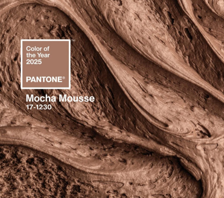
Why Pantone’s Mocha Mousse is the colour of 2025 and how to use it in your home

Mocha Mousse: the colour of connection and home
Since 1999, Pantone has announced a Colour of the Year that captures the global zeitgeist and influences trends across design, fashion, and interiors. From Cerulean Blue in 2000, symbolising serenity at the dawn of a new millennium, to last year’s Peach Fuzz, evoking warmth and connection, these colours tell a story of our evolving priorities. Mocha Mousse, with its rich, grounding tones, is the latest chapter—a hue that reflects a growing focus on sustainability and mindful living.
For me, it’s the colour of hope. Its association with natural elements like cacao and soil feels like an invitation to reconnect with the earth, to slow down, and to create spaces that are both nurturing and inspiring. In many ways, Mocha Mousse feels like the essence of home—a place where we grow, find balance, and root ourselves in what truly matters.
Why Mocha Mousse matters now
In the words of El País, this shade speaks to our growing need for sustainability and connection to nature. It’s a reminder to slow down, to ground ourselves in the rhythms of the earth. As The Guardian suggests, it offers a way to make peace with a changing world—grounded, comforting, and quietly revolutionary.
Brown has long been seen as humble, even overlooked. But Mocha Mousse reclaims it as aspirational. It’s the colour of cacao pods and fertile soil. Of growth, nurture, and resilience. It whispers to us that luxury doesn’t have to shout—it can be quiet, thoughtful, and kind.
Bringing Mocha Mousse into your home
So how do we bring this colour of hope into our homes? First, remember that Mocha Mousse is a Pantone creation—not a paint colour you’ll find on shelves. Instead, look for similar shades with a touch of warmth and richness. Sampling is your best friend here. Paint a swatch and live with it before committing. See how it plays with light and your own unique story.
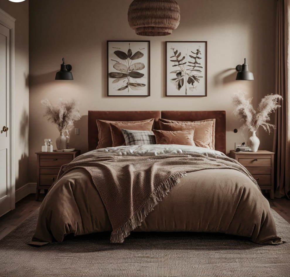
And here’s my favourite tip: be bold. Try colour drenching—painting walls, skirting boards, and even ceilings in the same shade to create an immersive, cocooning effect. Mocha Mousse is perfect for this. It’s soft but not shy, rich but never overwhelming.
Why colour matters in a changing world
Home is where we process the world, and colour sets the tone. Choosing a shade like Mocha Mousse isn’t just a design decision—it’s a declaration of values. A commitment to comfort, authenticity, and the beauty of the natural world. It’s a way to say, “This is my sanctuary. This is where hope lives.”
And if you’re not sure where to start, you’re not alone. Colour consultations with independent experts and brands are a fantastic resource. They can help you translate inspiration into reality—whether it’s a cosy Mocha Mousse living room or a rich accent wall in your kitchen.
Mocha Mousse as a metaphor - and an inside joke for my family!
To me, Mocha Mousse isn’t just the colour of walls or furniture. It’s the colour of roots—of digging deep, holding fast, and growing stronger. It’s the reminder that while trends come and go, home is where we find our footing in the world.
And honestly, Pantone's Colour of the Year's choice feels like a wink to my family. You see, we’ve had this inside joke that always makes us laugh. It goes back to when I was volunteering at my children's school Christmas fair, helping with face painting. It was one of those moments of chaos when we suddenly realised we didn’t have any brown face paint—a crucial colour for Rudolph’s face!
One of the other face painters dramatically exclaimed, “We need some brrrrroooowwwnnnn!” in a hilarious, exaggerated tone. It caught us all so off guard that we burst into laughter, and it’s stuck with my family ever since. Now, in any relevant situation, someone inevitably chimes in with, “We need some brrrrroooowwwnnnn!” My husband just suggested I add this story to this post; when he learned it I was writing about Mocha Mousse! You're welcome.
Also, can we take a moment to appreciate the differences in how we say “brown”? In English, it’s quick and casual, but the French version—marron—feels like it’s dressed for dinner at a fancy restaurant. Just me? Anyway, I digress...
Your turn
Would you invite Mocha Mousse into your home? Or perhaps it’s already there—in the patina of a wooden table, the texture of a rug, or the soil of your favourite houseplant? Connect with me on Instagram and view our post for more about the story of Pantone colours — I’d love to hear how this shade inspires you! (Comment "We need some Brown" on the Insta post and I'll send you a gift ✨✨)
*images lifted from widely used shots on Pinterest. They are not mine, and I could find no identifiable original photographic sources. If you know who those images should be credited to, let me know so I can support the people behind the camera by inserting their names 💚💚

